For some time, we have held the view that the UK stock market contains some decent companies that look cheap relative to a reasonable view of their future. We have not been alone in this regard, with other value investors making similar observations. Following last month’s “mini budget” I have seen at least one commentator[1] label the UK stock market as “uninvestable”. Where does this leave us? Is the UK presenting an opportunity for investors or is it a basket case?
Countries can become uninvestable when the rule of law is called into question, especially if this creates a risk of investors having their money confiscated. This is not obviously where the UK finds itself, but it does face multiple challenges.
The impact of BREXIT has, so far, been negative for the UK economy. It has limited access to the European Single Market, it has reduced the pool of available labour and has contributed to a falling exchange rate. On top of this the country finds itself with a high level of debt, an aging population, high inflation and a low level of productivity growth. However, many of these challenges that the UK faces are common to other developed countries. Furthermore, many “British” businesses are global and not singularly exposed to the UK economy.
The simplistic argument for the UK stock market being cheap rests on valuation metrics, such as the price earnings ratio, of the FTSE 100 versus that of other major stock indices. However, calculating one single number in this way tells you little about the individual constituents’ valuations, and is dominated by the largest companies as the indices are weighted by market capitalisation. In what follows we share some of our in-house analysis into the UK and US stock markets, where we attempted to do something more insightful.
The study that follows is based on data for every single company in the FTSE 350 and S&P 500 stock indices for the last 30 years, based on their historic constituents. By looking at the FTSE 350 we included a larger number of companies than the FTSE 100, with many more domestically focused businesses.
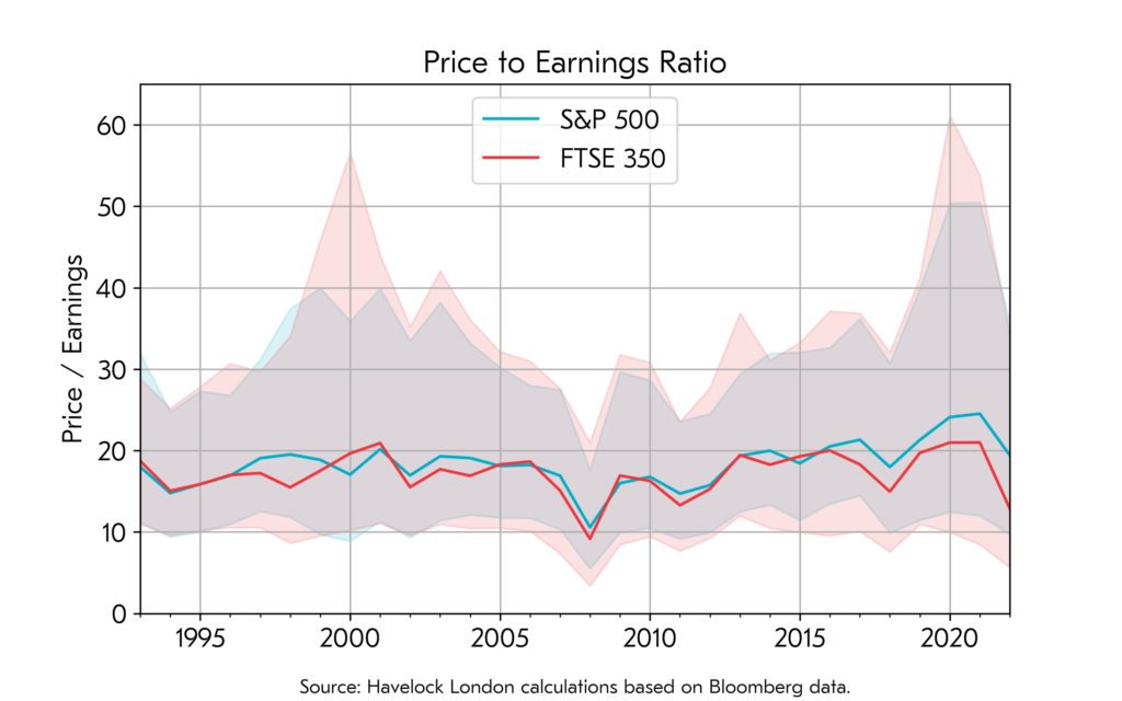
The solid line in the chart below shows the average (median) price earnings ratio for the companies in each index. This differs from the quoted ratio for the stock index, since each company contributes equally irrespective of its size. The shaded areas show information on the “dispersion” of the individual company valuations. We calculated these by ignoring the cheapest 15% and most expensive 15% of companies and show the range of valuations for the remaining 70%.

What does the chart tell us?
Firstly, the average company valuation in both countries has looked remarkably similar for most of the last 30 years. It is only in the last few that the US companies look, on average, more expensive than their UK peers. This corresponds to them also looking exepnsive versus their own history. Secondly, we have seen a high level of dispertion in valuations in both countries (made more extreme by the companies that had large falls in earnings during the COVID pandemic). For the UK there are now many companies experiencing really low valuations, matched only in the last 30 years by the 2008 crisis.
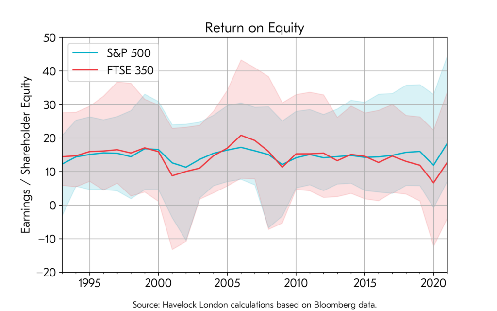
The next chart uses the same methodology as above, but shows the companies’ return on equity, with the bands again ignoring the “best” and “worst” 15% based on this measure. This is the ratio of earnings (or profits) to the amount of shareholder capital. This can be interpreted as how effective a company generates profits from its available resources – but it is not without its failings. For one it fails to distinguish between genuine efficiency and companies that just “leveage up” by taking on more debt.

The British and American companies have looked remarkably similar from this persective, except for in the last few years where the US companies have pulled ahead and delivered profits at a higher rate than in recent history. This could be a measure of how American companies have improved versus their UK peers, or it could equally be explained by them using more debt to leverage up their balance sheets.
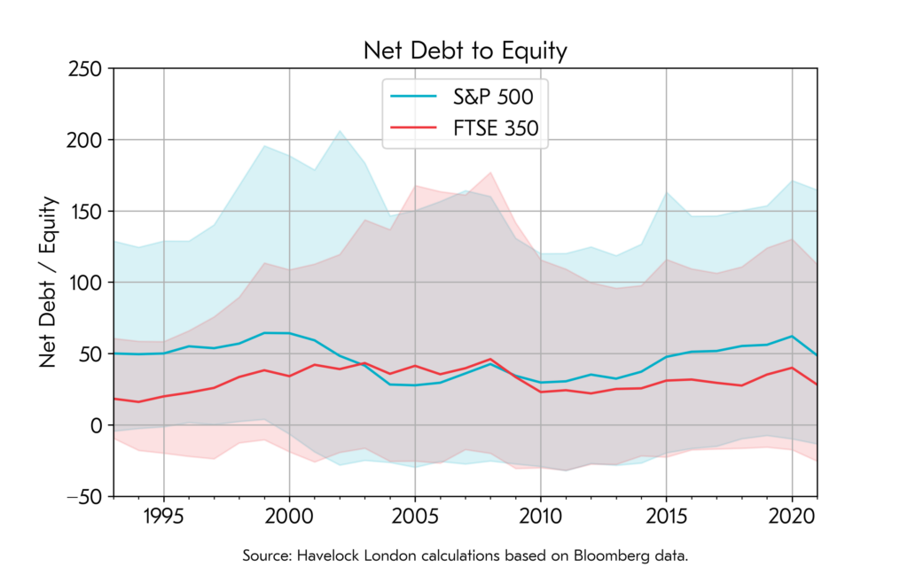
The next chart again uses the same methodology, and shows net debt to equity. This is the ratio of the companies’ debts, less any cash they hold, to the amount of shareholder capital employed in the business.

It is clear from this chart that the American companies do currently look more leveraged than their British peers. This is a trend that has played out since the 2008 credit crisis. We know that share buying backs have tended to simultaneously reduce shareholder capital, and increased debts, which could help explain this recent trend in the data.
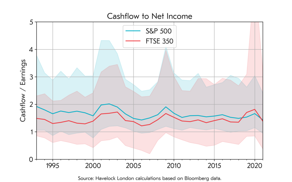
The final chart shows the ratios of company operating cashflows to their reported earnings. This chart is included for the cynics! The nuances of accounting give company management a certain amount of flexibility to put their actions in a favourable light. By comparison cash is a form of measurement that is far less open to being “massaged”. The chart shows that the US companies, unlike their UK counterparts, having been on a declining trend, with earnings having grown more quickly than actual cash in their till registers. It also shows that there is much greater dispersion for the British companies – with many companies generating low levels relative to their stated earnings.

What are my takeaway messages?
- British companies look cheap relative to their US counterparts. So much so that there are many British companies that appear to have “distressed” valuations.
- Despite recent price falls, US companies look expensive versus their own history. They also look more profitable than at any point in the last 30 years, which if not sustained will leave them looking even more expensive.
- The high level of profitability in US companies appears to be, in part, because their balance sheets have been leveraged up by simultaneously buying back shares and increasing debts.
- The high profitability of US companies versus history, is not entirely matched by growth in the cash they are generating. A cynic might suggest that this is the result of flattering accounting.
I do not know what is in store for the UK economy, but I think it is alarmist to suggest that the entire stock market has become uninvestable. Some of the challenges that the UK faces are unique, but many are common to other developed countries. I believe that some of the depressed valuations that we are witnessing in the UK will provide favourable opportunities for thoughtful investors.
I think the “macro-economic” risks of owning British companies need to be set against the risks that lie elsewhere. Many global investors have an outsized exposure to US companies, with their higher valuations, increased leverage and profits that are high versus both history and cashflows. This comes at a time when the US dollar has rapidly appreciated, saving many foreign investors from having felt the full force of this year’s downturn in US markets.
The valuation risk that I see in the US is of a “double whammy” impact of price earnings ratios simultaneously declining whilst earnings also fall. Furthermore, foreign investors risk being exposed to a “triple whammy”, where the US dollar also falls back towards historic levels against other currencies. This may not happen, but if it does it would be painful for many investors.
We move forward in the belief that whilst we cannot know what the future will hold, the biggest risks in investing are often those not seen by the consensus of public opinion.
[1] https://www.bloomberg.com/news/articles/2022-10-06/-uninvestable-uk-market-lost-300-billion-in-truss-first-month?leadSource=uverify%20wall